Theme Settings
Delivery Gateway allows you to fully customize how the Delivery Gateway widget appears on your storefront. You can manage global settings from the app dashboard and fine-tune the visual appearance directly within the Shopify Theme Editor.
Accessing the Settings
To access the configuration menu:
- Open the Delivery Gateway app in your Shopify Admin.
- Navigate to Theme settings in the left-hand sidebar menu.
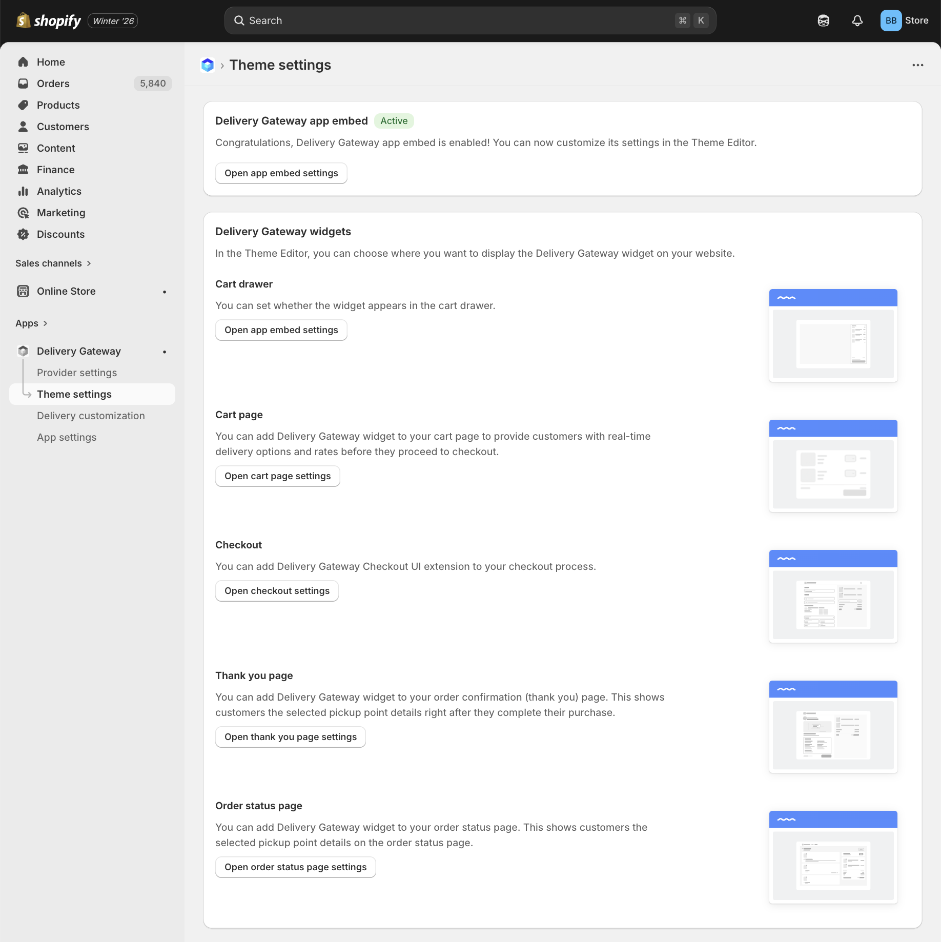
1. App Embed Status
At the top of the Theme settings page, you will see the global status of the app embed.
- Status Indicator: Look for the green Active badge. This confirms that the Delivery Gateway app embed is enabled in your current theme. If the badge is yellow and displays Inactive, you must enable the app embed to activate it.
- Clicking Open app embed settings button takes you directly to the Shopify Theme Editor, where you can toggle the embed on or off.
2. Widget Locations
You can choose exactly where the delivery widget appears on your website. Each block in the Theme settings menu corresponds to a specific stage in the customer's journey.
Cart Drawer
Displays delivery options directly within the side cart drawer.
To configure the card drawer, check out Cart drawer configuration.
Cart Page
Adds the widget to the standard full-page shopping cart.
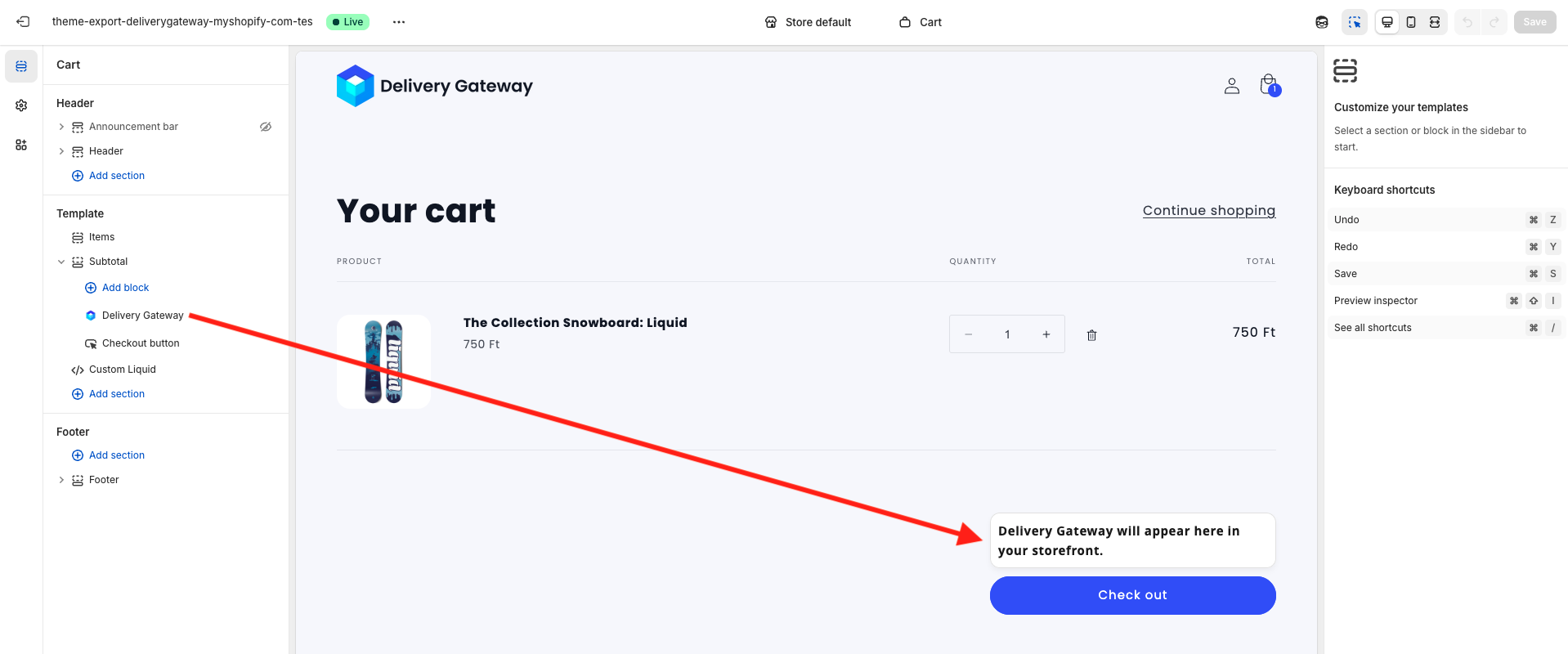
To customize the cart page, click Open cart page settings. This page lets you customize your Shopify cart page. To add the Delivery Gateway widget to the page:
- Select either Add block or Add section in the page structure.
- Select the Apps option.
- Select Delivery Gateway.
Checkout
Adds the Delivery Gateway Checkout UI extension to the native checkout flow.
Checkout UI extensions are only available for Shopify Plus merchants.
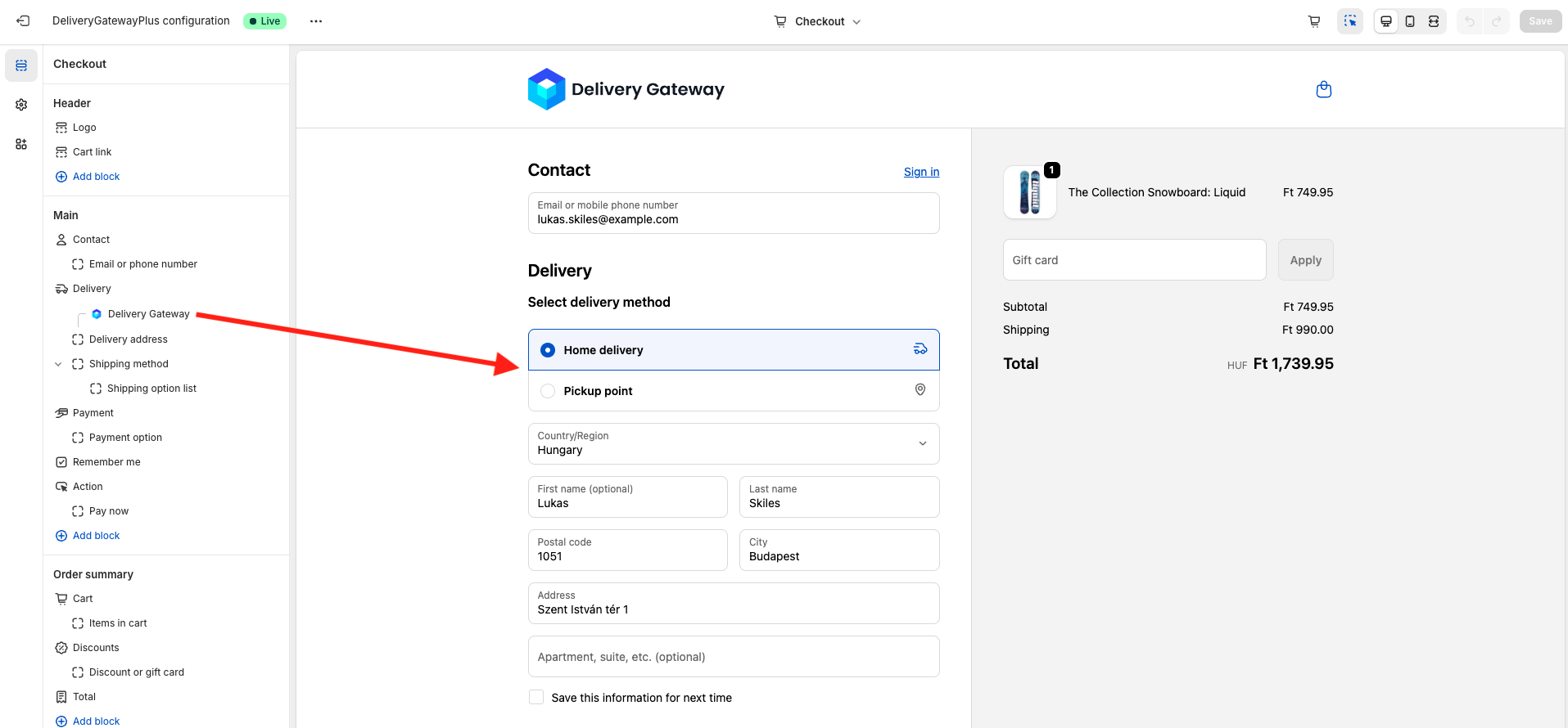
When adding the DGW Checkout UI extension, you can configure checkout behavior. Click Delivery Gateway in the checkout page structure to bring up the menu and select Checkout behavior.
- Allow app to block checkout: If the option is toggled on, customers can't proceed with their orders until they provide all the information required by the Delivery Gateway widget.
- Include block in Shop Pay: Shop Pay is Shopify's accelerated checkout feature. If the option is toggled on, the Delivery Gateway widget is shown in Shop Pay.
- Automatically expand sections to show app: Display the app in accelerated checkouts and where vaulted states display, such as when a customer with an account is logged in.
For more information, check out Managing app's behavior controls.
Thank You Page
Customizes the order confirmation experience. Displays pickup point details immediately after purchase.
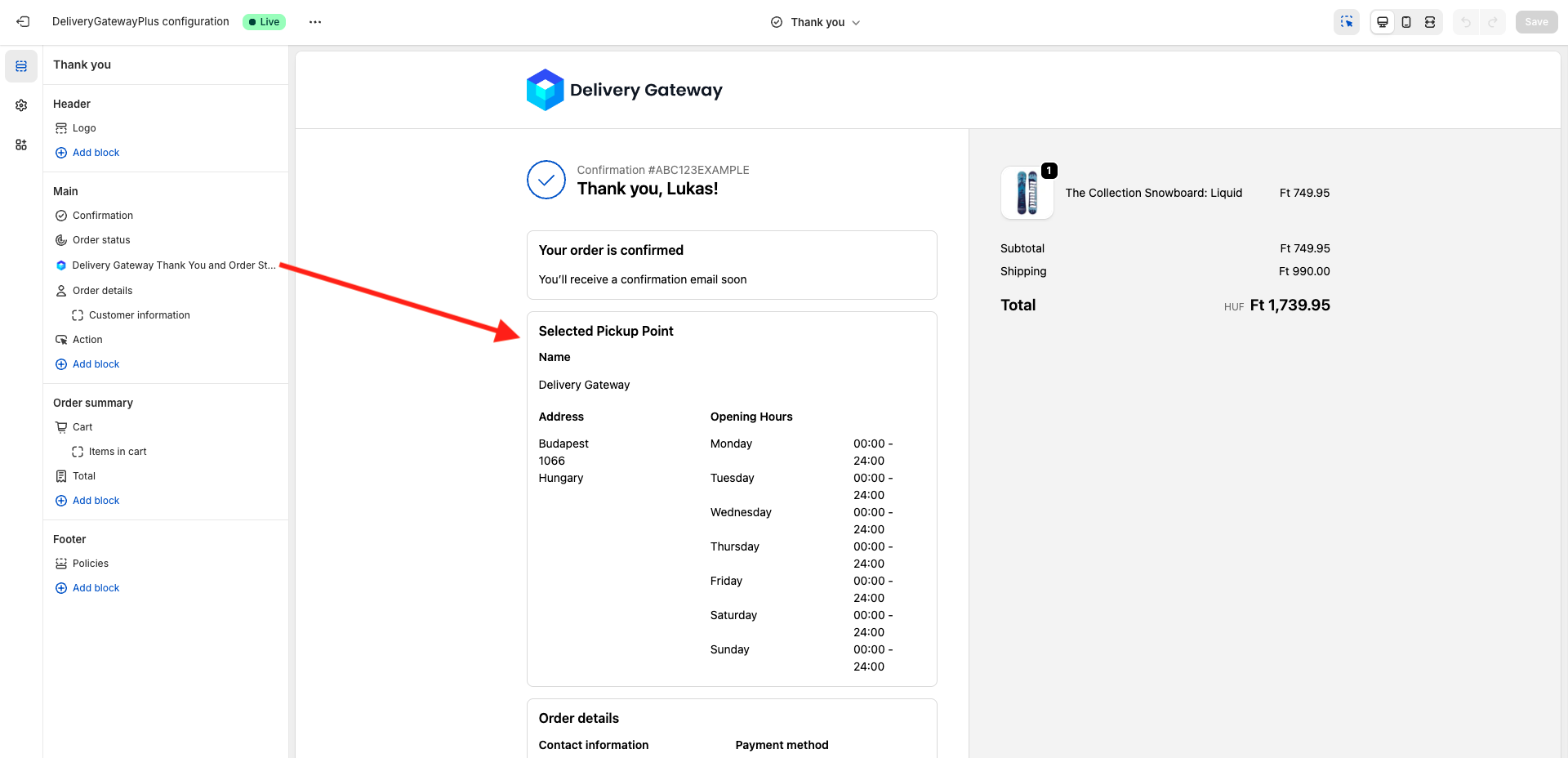
To customize the page, click Open thank you page settings. This page lets you customize your Shopify "Thank you" page. To add the Delivery Gateway widget to the page:
- Select either Add block or Add section in the page structure.
- Select the Apps option.
- Select Delivery Gateway.
Order Status Page
Ensures customers can reference delivery details later. Adds the widget to the Order Status/Tracking page.
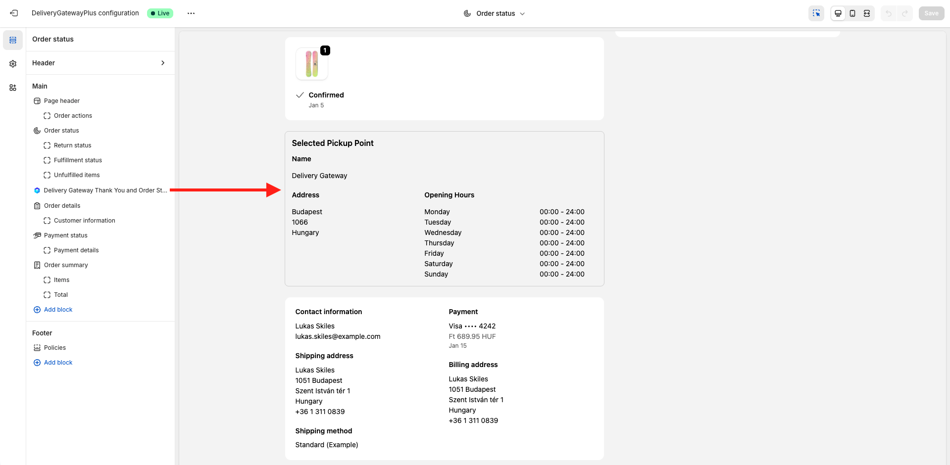
To customize the page, click Open order status page settings. This page lets you customize your Shopify Order status page. To add the Delivery Gateway widget to the page:
- Select either Add block or Add section in the page structure.
- Select the Apps option.
- Select Delivery Gateway.
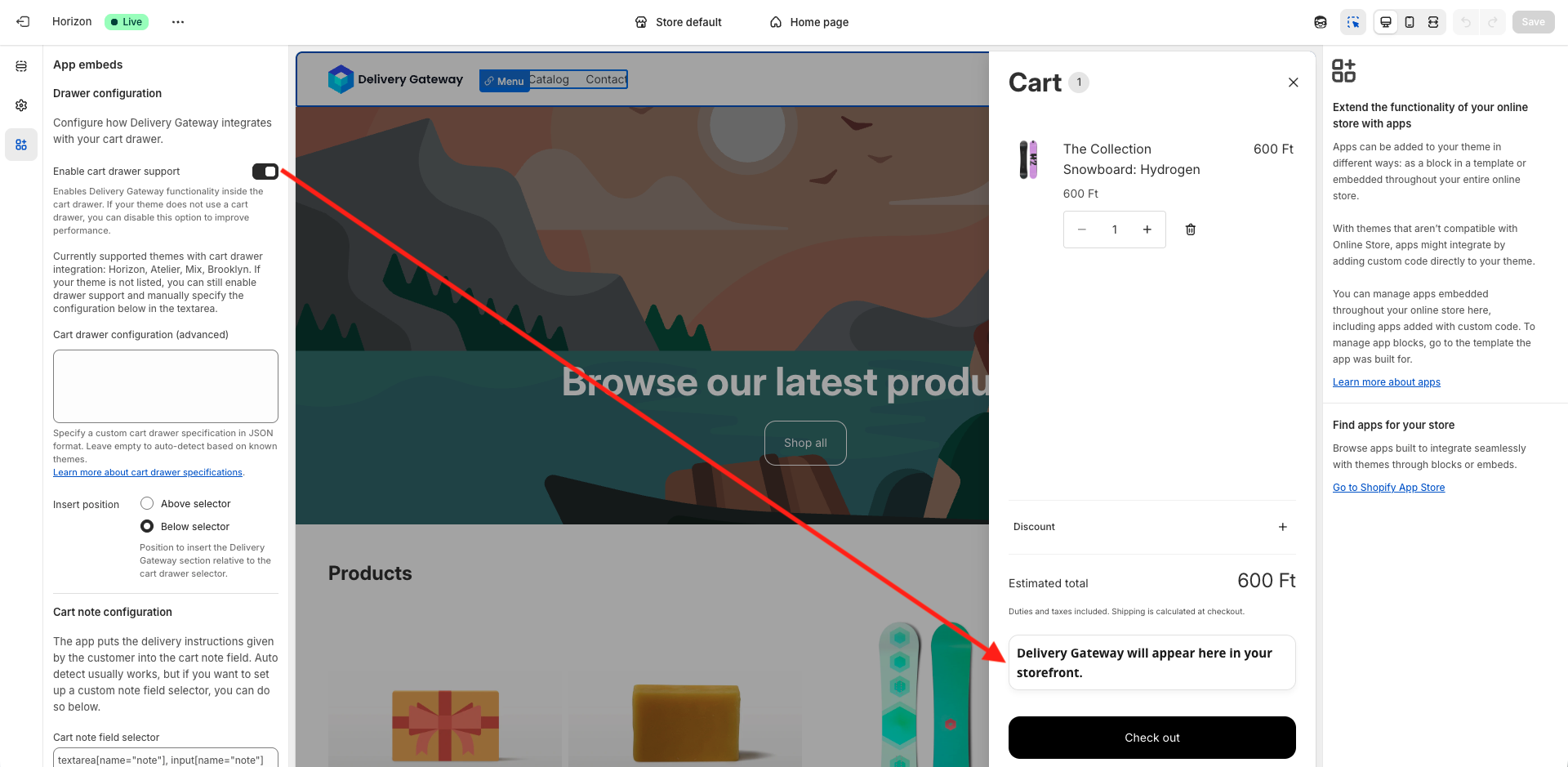
3. Visual Customization
Open the Shopify Theme Editor and navigate to the App embeds tab on the left sidebar. Ensure the Delivery Gateway Embed toggle is switched ON to enable the features.
You can configure the following sections to match the widget to your store's design and technical structure.
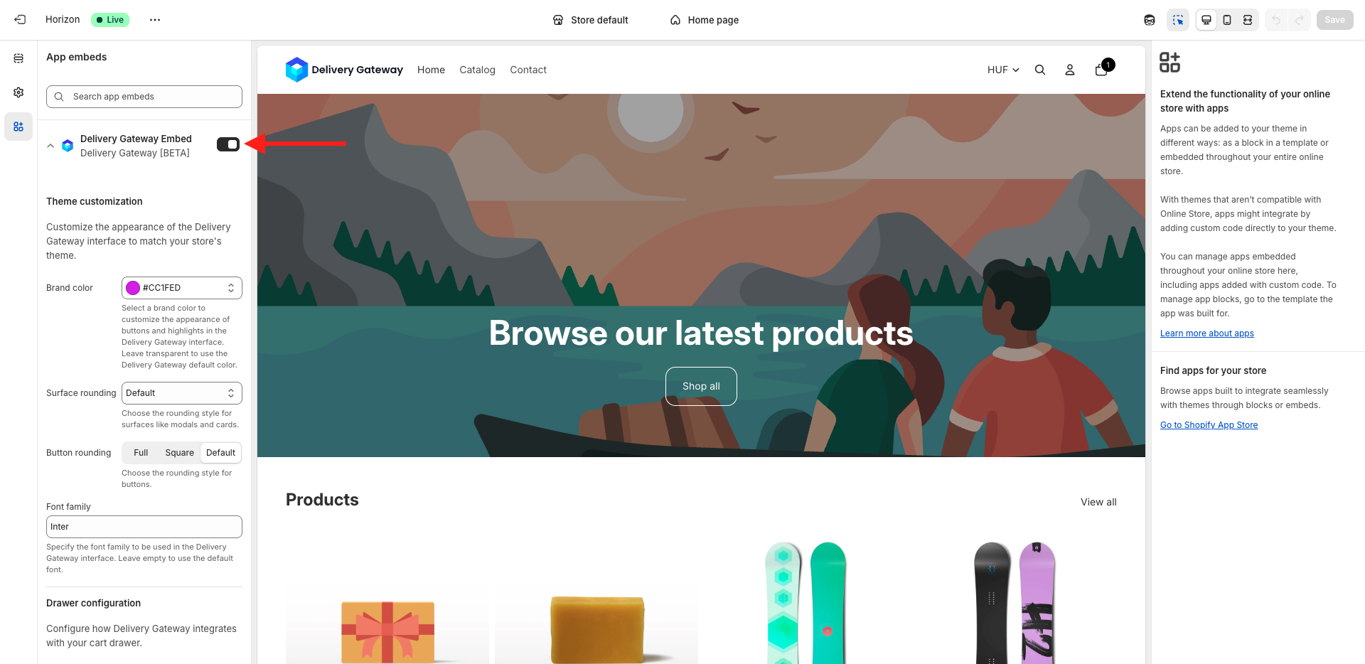
Theme Customization
This section allows you to control the visual appearance of the Delivery Gateway interface.
- Brand color: Select a primary color to customize buttons and highlights within the interface. If you want to use the Delivery Gateway default color, leave this field transparent.
- Surface rounding: Choose the rounding style for container surfaces, such as modals and cards (e.g., Default).
- Button rounding: Select the shape style for buttons. Options include Full (rounded), Square, or Default.
- Font family: Specify the font family name (e.g., Inter, sans-serif) to ensure the widget matches your store's typography. Leave this empty to use the default font.
Cart Drawer Configuration
This section manages how Delivery Gateway integrates with your store's Cart Drawer (slide-out cart).
Enable cart drawer support: Toggle this option to enable functionality inside the cart drawer.
The app currently has automatic support for themes like Horizon, Atelier, Mix, and Brooklyn. We continuously work to add support for more themes. Contact our support team if you need assistance.
Cart drawer configuration (advanced): If your theme is not automatically supported, you can manually specify the drawer's CSS selectors using JSON format in this text area.
Dialog-based drawer
This configuration applies to themes that use a <dialog> HTML element for the cart drawer. These themes typically render the drawer content inside a shadow DOM, which requires additional parameters. Such themes include, for example, Horizon and Atelier.
{
   "drawerSelector": ".cart-drawer__dialog[open]",
   "drawerContainerTarget": ".cart__summary-totals",
   "containerInsertPosition": "below",
   "portalShadowRoot": "dialog.cart-drawer__dialog",
   "resizeDrawerModal": true
}
Standard drawer
This simpler configuration works for themes with a standard <div>-based cart drawer that doesn't use shadow DOM; for example, Brooklyn or Mix.
{
   "drawerSelector": "#CartDrawer",
   "drawerContainerTarget": ".drawer__footer",
   "containerInsertPosition": "below"
}
{
   "drawerSelector": "cart-drawer.active",
   "drawerContainerTarget": "cart-drawer .cart-drawer__footer",
   "containerInsertPosition": "above"
}
Configuration parameters
| Parameter name | Description |
|---|---|
drawerSelector | The CSS selector identifying the main element of your theme's cart drawer. |
drawerContainerTarget | The specific element within the drawer where the Delivery Gateway widget should be anchored. We recommend placing this between the cart total amount and the checkout button. |
containerInsertPosition | Defines the placement relative to the drawerContainerTarget. Accepted values: above or below. This determines whether the widget is generated immediately above or below the target element. |
portalShadowRoot | The CSS selector for the shadow DOM root element. Required when the drawer content is rendered inside a shadow DOM (common in dialog-based implementations). |
resizeDrawerModal | Set to true to automatically adjust the drawer's height when the Delivery Gateway widget is added. This prevents content overflow in fixed-height dialog elements. |
Insert position: Choose where the Delivery Gateway section is inserted relative to the target selector:
- Above selector
- Below selector.
Cart Note Configuration
The app automatically saves the customer's delivery instructions into the cart's Note field.
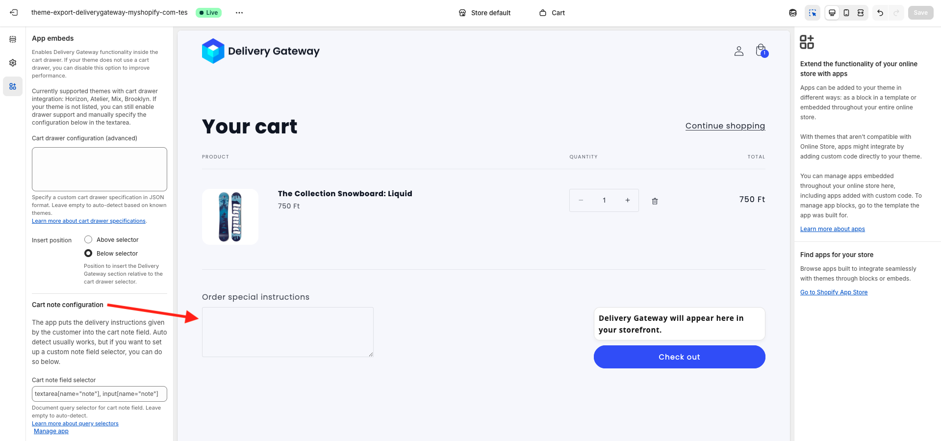
Cart note field selector: If the automatic detection fails, you can manually input a selector for your cart note field here. It uses the querySelector() method to look for the cart note. For example, textarea[name="note"], input[name="note"]. Read more about the selectors in the Javascript documentation.